Santorini Blue and Beyond: A Love Letter to Travel, Color, and Memory
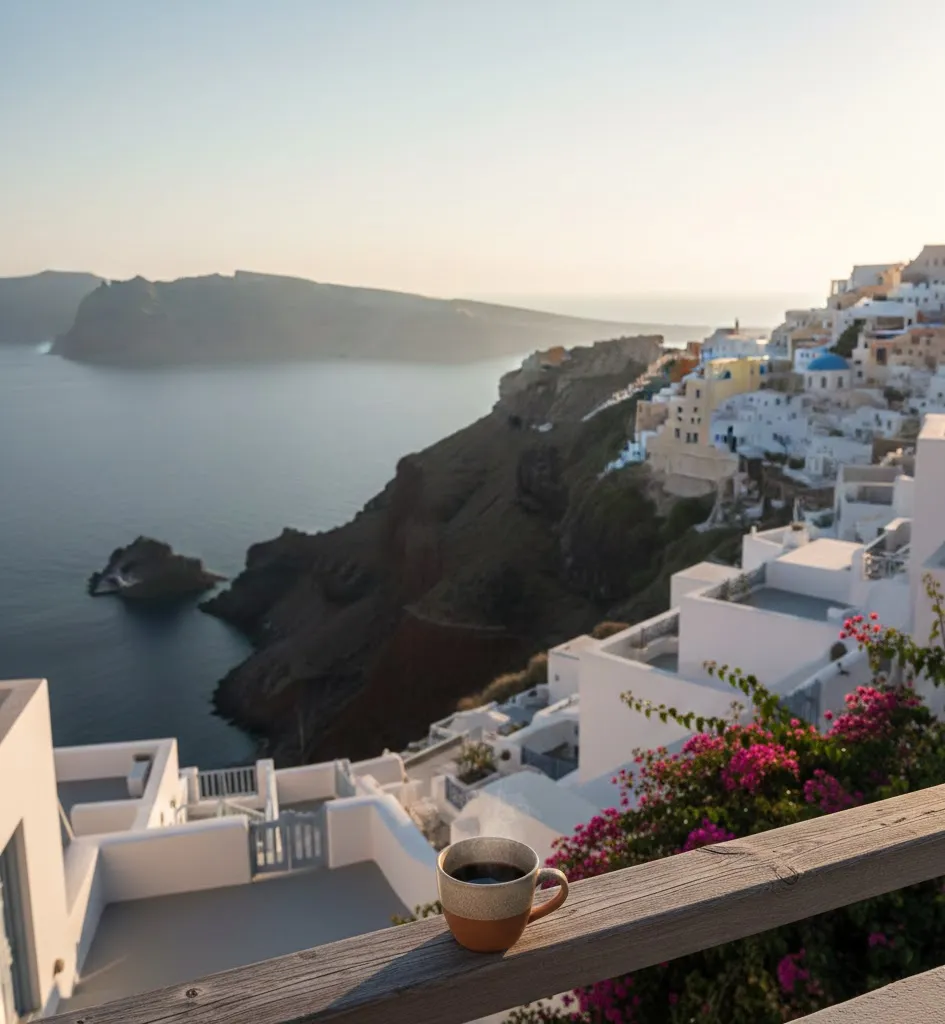
The moment I stepped onto my tiny balcony overlooking Santorini’s caldera, time didn’t just slow — it paused. The air carried salt, sunlight, and that uniquely Greek blend of warm breeze and sea spray. I cradled a coffee in one hand, and in the other, my nails — freshly painted cobalt blue — caught the same light as the Aegean stretching below. That blue wasn’t just a color. It was an emotional landmark, a memory I could wear long after I left the island.

That afternoon reshaped how I think about travel, aesthetics, and the way places integrate with our personal stories. In Greece, blue was more than a shade — it was a mood, a rhythm, a sense of balance. Now I want to show you how the blues of Santorini and other iconic destinations do more than decorate landscapes: they narrate our journeys. Whether you’re planning your first Greek island adventure or simply seeking ways to carry travel inspiration into daily life, this guide connects color, place, and memory in a way that goes beyond ordinary travel writing.
Recommended Travel Items for Your Trip
The Emotional Palette of Travel
Travel bars are full of photographs, souvenirs, and postcards — but color is the silent storyteller. It shapes how we remember places. In Santorini, the blue of the sea and sky hugs the whitewashed architecture so closely that it feels like an embrace. Even without words, the colors whisper stories of endless horizons, warm breezes, and sunset reflections on caldera cliffs.
Psychologists note that certain colors have emotional resonance. Blue, for example, tends to evoke calm, trust, and mental clarity — sensations we often chase when traveling. That’s why the blues of Santorini feel grounding, like an internal exhale. When a place feels as much as it looks — that’s when travel becomes personal, almost poetic.
But let’s go beyond emotional language and connect this insight to real moments, real places, and real ways to carry your travel experiences into everyday life.
Why Santorini Shows Up in So Many Travel Dreams
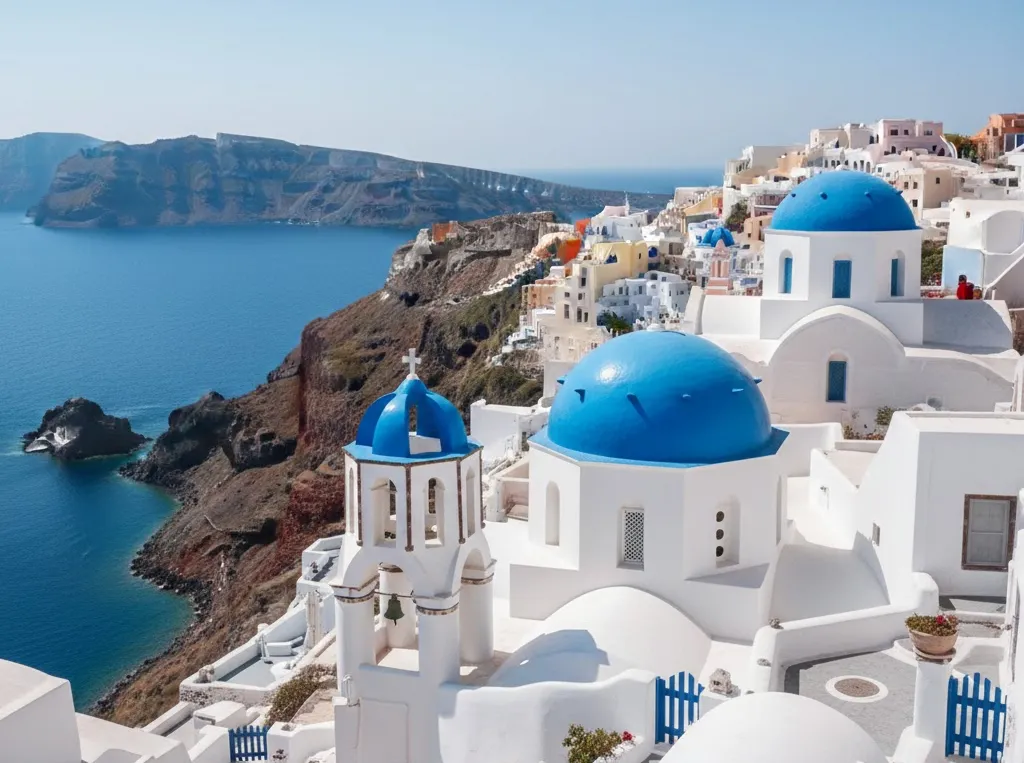
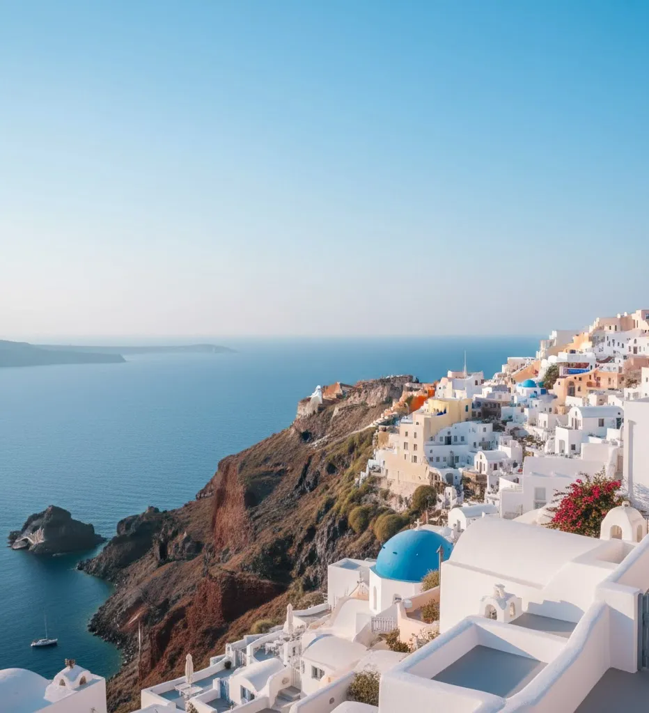
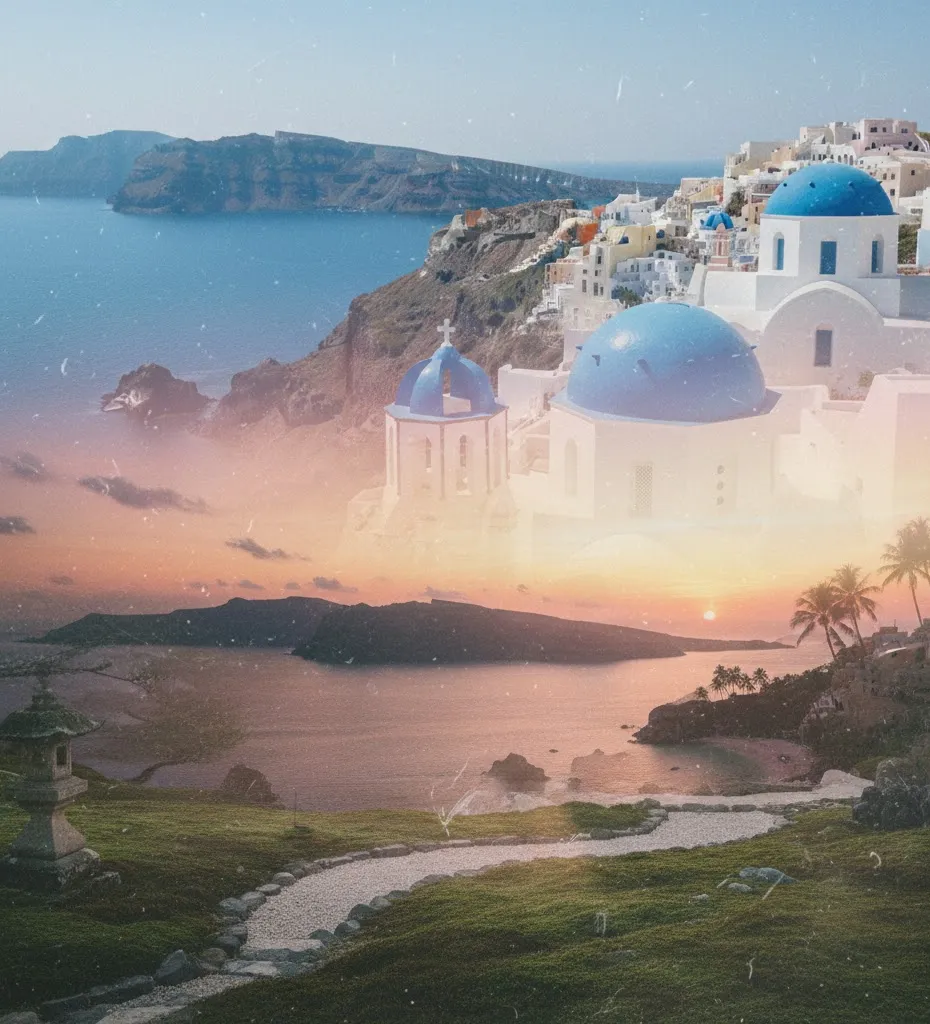
Santorini’s iconic blue is inseparable from its setting: perched atop volcanic cliffs, the caldera drops dramatically into the Aegean Sea. The island’s whitewashed buildings and cobalt domes mirror the Greek flag itself, forming a visual language that travelers instantly recognize. Whether you’re wandering Oia’s narrow streets, watching a sunset in Fira, or relaxing on Kamari’s black volcanic sands, that blue-and-white aesthetic becomes part of the sensory memory you take home.
Santorini is more than its color palette — it’s a multi-sensory experience that blends:

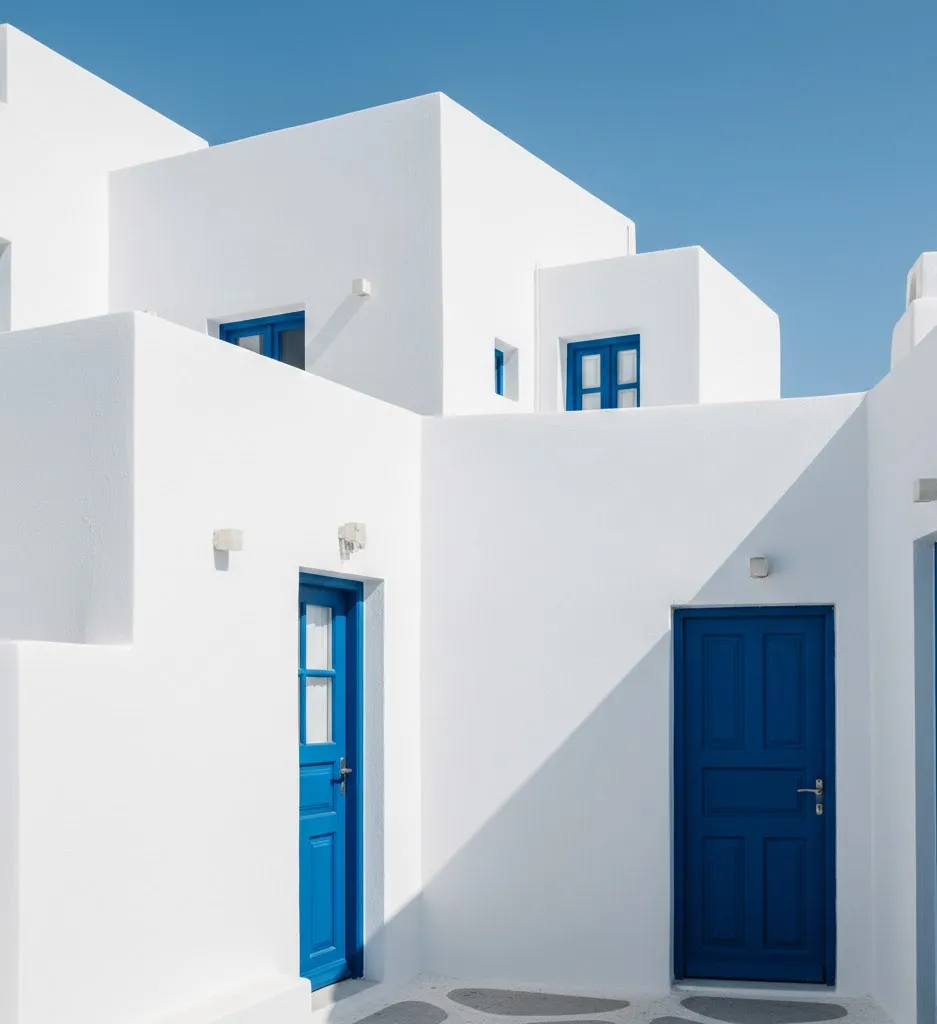
- Architecture infused with light: Whitewashed buildings reflect heat while creating stunning contrasts with the deep blue sea.
- Spectacular sunsets: When the sun dips below the horizon, pinks, purple, and warm golds spill across the sky — reminding you that color in travel doesn’t exist in isolation.
- Mediterranean texture: The salty breeze, crumbling stone pathways, and the rhythmic motion of the Aegean all anchor the visual palette in lived experience.
These elements make Santorini a destination where color feels like place — not just aesthetic.
How Color Tells Travel Stories
We all remember places by more than names and dates. We recall colors that transported us.
In Bali, the coral sunsets might become the warm glow of your daily journaling light. In Kyoto, the delicate greens and earth tones of moss gardens echo long after you’ve left the stone paths. And in Santorini, those blues and whites become shorthand for calm mornings, bright afternoons, and evenings steeped in Mediterranean warmth.

When I think of Santorini now, it isn’t just the shapes that come to mind — it’s the shade of the Aegean at midday, the gradient of twilight on Oia rooftops, and the contrast of blue against sun-bleached stone. Those colors become memory triggers, embedded in how I recall sound, scent, and feeling.
Bringing Santorini’s Palette Into Your Daily Life
Whether you’re back home after returning from the Greek islands or preparing for your first European adventure, here are travel-inspired ways to keep that aesthetic alive:
1. Capture the Landscape in Your Photos
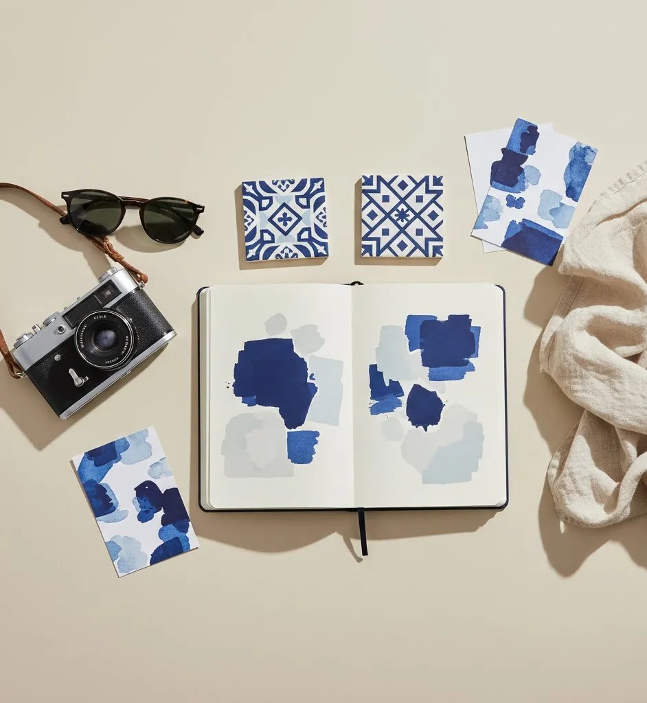
When you edit photos, use tools like Lightroom or Canva to sample the exact colors that define your favorite views — whether it’s the Aegean, a desert horizon, or a tropical canopy. Pulling these hues into your travel album or wall prints keeps the memory vivid.
2. Personal Aesthetics With Meaning
Much like nails that reflect Santorini blue, you can anchor colors into your daily routines. Choose travel-inspired palettes for your wardrobe, accessories, or home accents — subtle reminders that every journey leaves traces in unexpected places.
3. Creative Storytelling

Write brief travel reflections tied to color: the blue of a sea-facing café in Santorini, the shimmering gold of Sahara sand dune light, or the jade reflections of a Kyoto garden pond. These snapshots become more powerful than generic travel journals.
These ideas transform travel from photos and souvenirs into lived memory.
Why Colors Deepen Travel Experience
From a marketing or SEO perspective, color motifs tap into vivid imagery that resonates with readers and keeps them engaged. But beyond metrics, this approach helps you:
- Anchor sensory memory: Color intertwines with other senses, making memories richer.
- Create unique narratives: Color-based storytelling feels personal and poetic.
- Connect travel experiences: Colors link place to emotion and memory in ways words alone cannot.
Travel isn’t just where you go — it’s how you remember it. And often, color becomes the shorthand for that emotional geography.
Practical Tips for Travelers Who Love Color

If you’re inspired by Santorini blues and other destination palettes, here are some hands-on ways to incorporate that into your planning and storytelling:
Build a Travel Color Map
Before you travel, create a mood board or digital palette inspired by your destination. Include photos of architecture, landscapes, textiles, and local art. This primes your eye to notice color themes when you’re on the ground.
Photograph Intentional Details
Don’t just capture landmarks. Frame shots of doors, tiles, rooftops, water reflections, and sky gradients. Detail photos often become your most powerful travel memories.
Journal With Color Descriptors
Instead of writing “I saw a blue sea,” describe it as “a shade between turquoise and cobalt, where sound and light merge into calm.” This deepens the memory beyond surface observation.
These simple habits turn travel into multisensory storytelling, and they help you craft travel narratives with emotional weight.
Santorini Travel Planning — Before You Go

Here’s how to get the most out of your Santorini experience:
Best Time to Visit
Santorini is most popular between late spring and early fall. The shoulder seasons (May and September) offer warm weather, dramatic sunsets, and fewer crowds.
Where to Stay
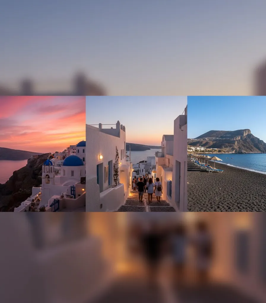
- Oia: Iconic views and postcard architecture.
- Fira: Central and lively, great for exploring on foot.
- Perissa / Kamari: Black sand beaches perfect for relaxed beach days.
Each location offers a distinct light quality, shifting the way colors appear throughout the day.
Don’t Miss…
- Sunset in Oia: The way the blue of the caldera shifts into warm hues is unforgettable.
- Local cuisine: Fresh seafood, fava, and Greek wine deepen the sensory experience.
- Cultural color inspirations: Explore local art and ceramics to see how Greeks interpret their natural palette.
These experiences layer meaning into your visual memories.
Stories From Travelers: How Colors Shape Journeys

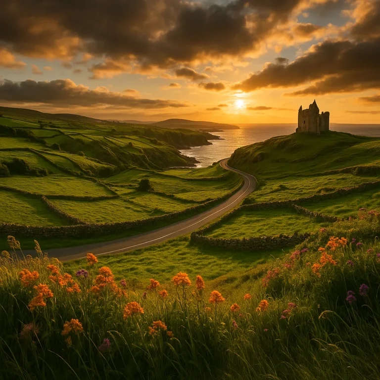
Readers often share how certain hues bring back travel memories instantly — a coral sunset that reminds them of Bali, emerald fields that echo the hills of Ireland, or a deep lavender twilight over Greece’s caldera. These colors don’t just revisit places in memory; they anchor emotional truths about the places that moved us most.
Color becomes shorthand for the way we felt there.
Closing Thought: Travel Is Painted in Memory
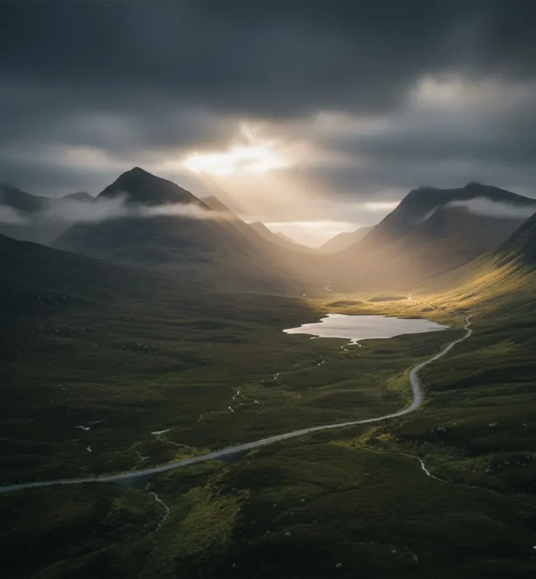
Travel leaves marks not just in photographs, but in the way we carry moments forward. The bluest part of the Aegean sea, the golden warmth of a desert sunrise, or the teal depths of an island lagoon — these are the pigments of experience.
Maybe your travel color is Santorini blue. Maybe it’s the soft terracotta of Marrakech dusk or the jade of Kyoto gardens. Whatever it is, let it remind you that travel isn’t only about miles — it’s about incorporating the world’s tones into your internal landscape.
When you connect destination, sense, and memory, your journeys become stories you can hold — not just recall.
If a color ever brings you back to a place you loved, I’d love to hear what shade stays with you long after the journey ends.